If you’ve been following the WordPress Reviews section of this site, you may have realised that I am a fan of premium WordPress themes, the main reason being that they generally look really good, have lots of functionality, and often take WordPress in the direction of a CMS rather than a pure blog format. So why did I choose a free theme for this site rather than go for one of the premium themes I usually recommend?
If, like me, you have spent hours, if not days, endlessly searching for a new theme, it soon becomes apparent that themes fall into 2 main types: magazine or blog. I didn’t want a pure blog layout nor a news portal magazine theme, and there aren’t so many choices once you exclude those two options.
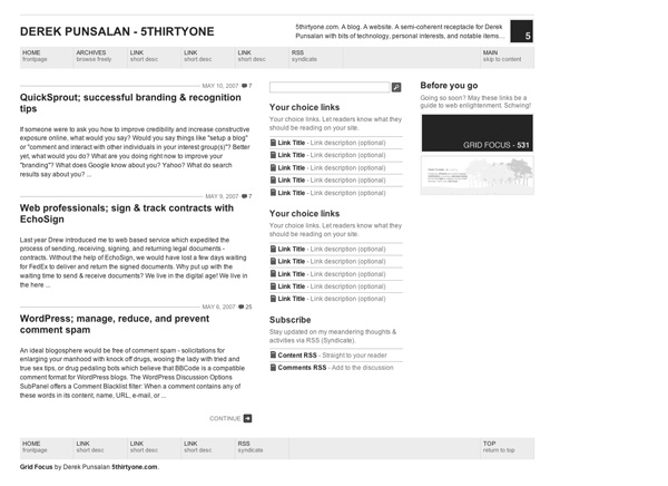
Although I use Revolution themes for various projects, and I’m a great fan of Brian Gardner’s work, I wanted to take a break from working with Revolution for no other reason than wanting to play around with someone else’s code for a bit! In fact, any one of the Revolution themes would have been ideal for this site. However, after much googling I happened to stumble upon Derek Punsalan’s site www.5thirtyone.com. His Grid Focus theme immediately caught my eye and having downloaded the theme (did I tell you it’s free?) and quickly looked at the code, I decided that this theme would become the basis of this site.
If you’re looking for bang up to date theme wizardry, you won’t find it with Grid Focus. Instead, the theme is rather barebones in nature, but simple to understand and an ideal canvas for customising. I like the simple, grid-based layout, and the fact that the designer hasn’t made too many decisions for me in terms of the way the theme works. There is no support for widgets and even the main links section is designed to be hardcoded! But for me, this makes it fun to use as I can slot in all sorts of template tags to make the theme more dynamic. And adding widgetised areas to a theme is always a possibility if I need to. It is therefore highly customisable and is a great blank sheet of paper for me to play with over the coming weeks.
The code is light (in fact all pages are driven from just one index.php file) and well-structured. I also like the CSS which has been sensibly thought out and won’t cause problems once you start customising and adding new classes. Finally, and not unimportantly, the light file size and lack of graphic-driven structure makes the site fast loading. Nice!
So, that’s it! Studiograsshopper is going back to basics and happily using Grid Focus in the process. Thanks, Derek, for a great theme!
If you’re looking for a new theme for your site, you might want to look at 6 essential checks before buying a premium WordPress theme for some important points to consider.


Glad the theme worked out for you. Just an FYI, the code was update / re-written. I’ve stripped out a little more styling making it a cleaner canvas for customizing. I have also added widget support – much requested and super late feature request answered.
Derek,
Thanks for “heads up”, I will check out your new version. Actually, one of the reasons I choose your theme was because I liked the way it had been coded, and found it easy to customise.
Keep up the good work!
First let me say thanks SG for such a great site. I come here often for tips and as you will see you inspired the layout of my grid focus theme. However I am having a problem with the theme showing up in IE7.
I tried adding ” overflow: hidden; ” in the line below but it did nothing. I think that’s because Derek already had the overflow code in this string. CAN YOU HELP? Thanks in Advance.
.secondaryColumn {
float: left;
margin: 28px 0 0 30px;
overflow: hidden;
width: 240px;
Sorry I should clarify that my problem is … my third column is showing up below my main content (not to the right).
Hi Curtis,
Thanks for your nice comment – glad you find the site interesting.
If the site looks OK in other browsers than you’re right, it’s a CSS issue. Try reducing the 30px margin and see if the column appears correctly. I don’t think this is an overflow issue however, I think it is simply that IE is much stricter about the width of divs etc and your nested containers (divs) are too wide for their parent container. Hope that makes sense!
If that doesn’t work, post a link to your site and I’ll take a look. 🙂
I reduced the 30px margin but it did not fix the problem.
http://www.sustainablecoin.com
Thanks for the help!
Curtis,
I think you have some broken tags in your code somewhere. Run your site through the http://validator.w3.org/ validator and fix those errors. That will probably sort out your IE7 issue.
Alternatively, hire me and I’ll fix it. 😉
Cheers,
Ade.
I wish I could afford to hire you..lol. I did run my site and it seems fine. I put in a post to Derek so lets see what he comes back with.
Till then – Kudos!
@ Curtis
Ok. Hope you get it sorted! 🙂
Nice looking site! I’m curious how do you get the image in your post to enlarge and open within your blog? Are you sing a plugin for that?
Yes, a plugin. Shadowbox.