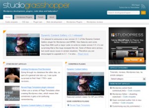
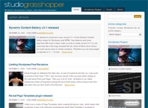
New Year, new theme! Having got a little bored with my existing theme, the excellent Shades of Blue free theme from Studiopress, I’ve just finished a couple of days of extensive re-theming of Studiograsshopper. Once again, I’ve gone with a Studiopress theme as the basis for the site makeover, this time using the rather splendid Chrome theme.
Before and After
A quick look at these before and after screenshots shows that although the customisations I have made are quite extensive, the theme is still recognisably based on Chrome.
Note: “After” picture shows the home page almost finished.
And here’s a comparison with the former Shades of Blue theme:
What was wrong with the old theme?
Frankly, nothing. I’ve really enjoyed using and customising Shades of Blue, especially because it is a very simple, straightforward theme, without complicated theme options to deal with when customising, and the colours really grabbed me (and are now the basis of the “Studiograsshopper branding”).
I had, of course, made extensive modifications to the “out of the box” Shades of Blue, but decided that I now wanted a re-freshed look with more white space, and a wider main content area better suited for displaying blocks of code and the forum pages. I also felt a little restricted with the existing navigation and home page layout, and wanted to improve these aspects. So, thank you, Studiopress, for Shades of Blue. It’s been fun, but New Year means new theme – so time for a change.
Why did I choose Chrome?
Firstly, as I mentioned when changing from the Grid Focus to Shades of Blue, it’s Studiopress – so I know it’s been well coded and nicely done.
Secondly, I’m very familiar with Studiopress themes, so I knew it would be a doddle to customise.
Thirdly, I wanted the following features:
- Two-column layout with a wider main content area than Shades of Blue – perfect for displaying code and the forum pages.
- More white space and cleaner looking typography.
- Full width header and footer to give a “faux-fluid” look. It is in fact a fixed width design (which I much prefer for all sorts of reasons), but the full width header and footer, combined with white body background, really opens up the page visually.
- Narrow-ish header. I work 99% of the time on a laptop with a 15″ screen and I just hate having to scroll the page just to get past an enormous header/banner to see some content. Chrome’s 100px header height (the logo area above the navigation bars) is at the upper limit of my preferences, but meets this requirement.
- Category navigation menu. Although a considerable proportion of the content on this site is Page-derived (all the plugin content is rendered using Pages, for example) rather than Posts, with Shades of Blue I only used a main Pages menu plus a dropdown select box for Categories. Over time, I became increasingly unhappy with this and wanted to give more prominence to articles and categories. Chrome’s clean and uncluttered category menu bar fits the bill perfectly, and the tabbed main menu mimics the Shades of Blue menu very nicely.
- Slightly more “magazine” than “blog” style home page, in order to display more content to visitors. Chrome is, basically, a magazine layout, but isn’t as obviously “newspaper-y” as many magazine-style themes. As I consider that this site is more CMS than blog, Chrome’s home page meets my requirement.
Finally, a major advantage of sticking with a Studiopress theme is that the majority of CSS classes and ID’s are common to all of their themes. This makes re-theming much easier than it might otherwise be, especially given the large number of CSS changes I had made to the old theme which needed to be ported to the new theme.
Doing the modifications
If I hadn’t made so many changes to the old theme, swapping over to Chrome would have taken a lot less time than it did. However, as is the way when a site evolves over time, I had created quite a few Page Templates to display the various plugin Pages on the site, meaning that each one had to be recreated for the new theme. Luckily, as mentioned above, the XHTML markup and CSS classes and ID’s are fairly consistent across the two themes, so this wasn’t as big a job as it sounds.
A more time consuming job was adding to the new stylesheet the various custom CSS styles and selectors I had added to Shades of Blue. Unfortunately, it’s not as simple as copy-paste because I didn’t want to overwrite (or rather over-ride) some essential base styles in the Chrome stylesheet. The majority of these were needed for the new theme, and some time was taken to carefully go through the site page by page, checking that the layout was working as expected.
I also took this opportunity to remove any inline styles and add them to the stylesheet. This will make life much easier next time I re-theme.
Many posts display an image at the top of the article. With Shades of Blue these were all floated right, but look better floated left with the new theme. This means editing each post and changing the image alignment. Not a huge job, but quite time-consuming. I’m sure I’ve missed a few, too…
Thankfully, the wonderful Theme Test Drive plugin allowed my to work on the live site while doing these modifications. Theme Test Drive is really useful for re-theming because logged-in Admins can see the new theme – but other visitors/users can’t. Highly recommended!
Main customisations
For those that are interested, here is a brief list of the major customisations:
- jQuery Accordion for a sliding div effect on the Dynamic Content Gallery Configuration Guide page.
- AJAXify FAQ-Tastic plugin for a nifty accordion effect on the the plugins’ FAQ pages.
- The timthumb script is used to generate thumbnails on the home page and archive pages. Chrome doesn’t utilise timthumb, so imported this code from the Studiopress Magazine theme.
- Data on my WordPress plugins pages is automatically pulled in from the WordPress.org plugins repository using John Blackbourn’s rather marvellous Plugin Info plugin. This saved me a hell of a lot of typing/copying-pasting! This solution still isn’t perfect though, mainly because John hasn’t managed to keep up with some recent changes to the WordPress repository API. He’s working on it, so I’m hopeful that the final glitches (screenshots do not display, for example) will be ironed out soon. (I have complete sympathy with John – maintaining free plugins is time consuming, and will always take second place to paid work and other commitments. I can wait.)
- Custom 404 page, based on an idea posted on yoast.com.
To do list
Inevitably, although I’m 95% finished, there is a list of things which still need to be sorted out:
- Update the Forum page CSS.
- Reorganise and merge some Page Templates and use Conditional Tags to determine the format of the content to be displayed. I’m not rushing though, thanks to my own Reveal Page Templates plugin which helps me easily keep track of which Page is generated by which Page Template.
- Add widgetised areas to the footer for quick links, subscribe form etc.
- Re-vamp the home page sidebar – again, using Conditional Tags.
- Check all post images and re-align to float left, rather than the float:right
used with the old theme.
I’m sure I won’t finish everything on the list, and I’m equally sure that I’ll change my mind and re-tweak various elements of the theme in the coming months. But hey, that’s the fun of this WordPress lark! 🙂


Here is a basic example I noticed your using studiopress well so am i :lol
In your search for form you have “search studiograsshopper” very nice I would like to mode this simple thing….
In the basic search form it is “search this website”
Now to change this simple message should so so easy yet it is not !@
If you are using Genesis, you need to use this Genesis filter:
genesis_search_textYou can then specify your own text to replace the default “Search this website…”.