What makes a great Theme stand out? Colours, logo, organisation of the home page? Sure all of these things are important if a theme is going to catch my eye. But what I really like to see is detail in the aesthetics and a key detail is how text aligns with images on the page.
This is so easy to get right I am surprised that more theme designers don’t consider this when matching image sizes with their chosen typography, specifically line-heights and font-size. So, the purpose of this article is to show you how to get this right and achieve a more professional looking page layout.
Here’s the problem:
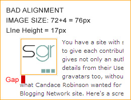
Pretty ugly, yes? So what’s going on? The chosen typography is a font-size of 11px and a line-height of 17px. The embedded image is 72px x 72px with a padding of 1px (on all sides) and a border of 1px. You can see the result – the bottom edge of the image aligns awkwardly with the adjacent row of text.
To correct this, we simply need to take into account the line-height when sizing the image. We have a slight complication in our example because the CSS style for the image tag adds a padding of 1px on all sides plus a 1px border. Therefore, if we want the image to align perfectly with 5 lines of text, as in the example shown, the overall image height including padding and border should be 5 x 17px = 85px.
Allowing for the padding and border, which will be added by the CSS, we need to deduct 4px from the calculated image height, therefore giving an actual image height of 85px-4px=81px. This gives us a mathematically correct relationship between the text line-height and the height of the image. Here’s what this looks like:
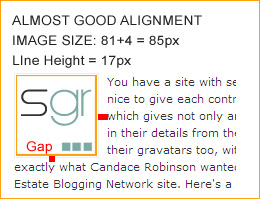
Much better, yes? Well no, actually. Although a vast improvement (and as my grandmother used to say, “a man on a galloping horse would never notice”) the row of text that wraps underneath the image looks a little tight to the image compared with the margin between the right-hand side of the image and the block of text.
So, here’s a second and final attempt:
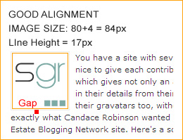
This is much better! All we’ve done is to reduce the actual image size by a further pixel so that it is now 80px by 80px. Adding in the padding and border set by the CSS, the overall image height is 84px. To me, there is now better visual balance of the whitspace around the image and the text wraps smoothly underneath the image.
Now that we’ve seen the results of these experiments, we can come up with some basic rules for perfect image sizes and apply it to all images throughout our site:
- Rule One: The overall image height including IMG tag padding and borders set by your CSS must be an EXACT multiple of your text line-height. Simple, but effective.
- Rule Two: Don’t be afraid to break Rule One, as we did earlier, and reduce the mathematically correct image height by 1 or 2 pixels in order to create a visually pleasing result, with balanced whitespace.
- Although our example shows a square image, the same principle applies to images of any size: make the image height an exact multiple of your line-height.
In my opinion this kind of attention to detail makes an enormous difference between an OK looking site and a really nice looking site. It’s not hard to do – once you’ve worked out your typography, ie the line-height – and will significantly improve the look of your site and give it a more polished and professional appearance.
A final thought…
Observant readers will have noticed that the margin between the right-hand side of the image and the text block doesn’t look “right”. And you are correct. In the next article in this series I’ll be following on from these ideas to look at Borrowing layout ideas from CSS grid systems to see how we can improve our layout even further.

